Introducing ecru: eggersmann Color System Offers a New Standard of Subtle Luxury
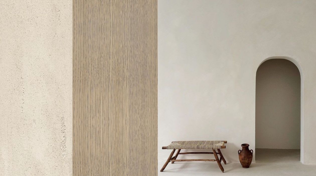
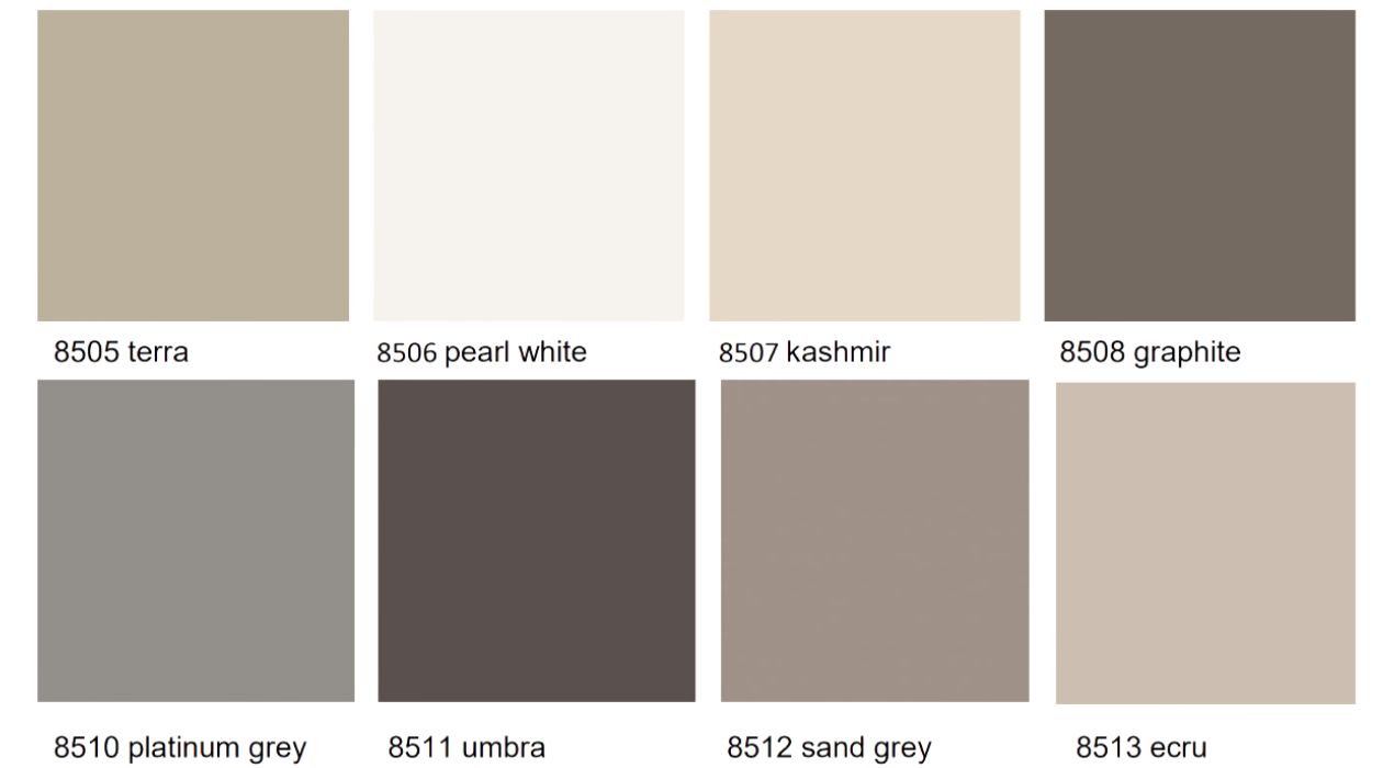
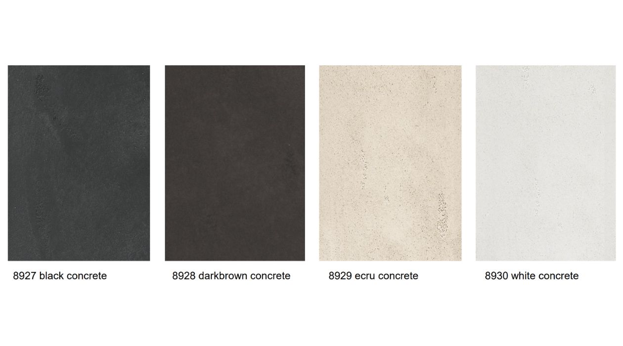
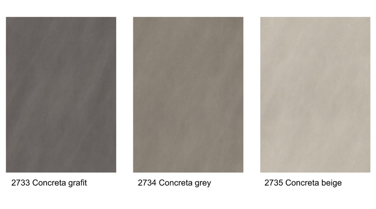
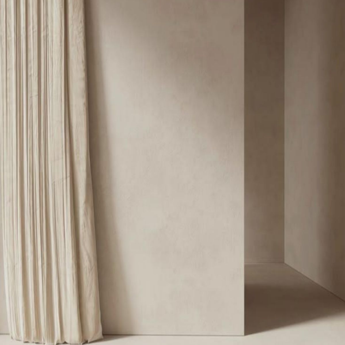
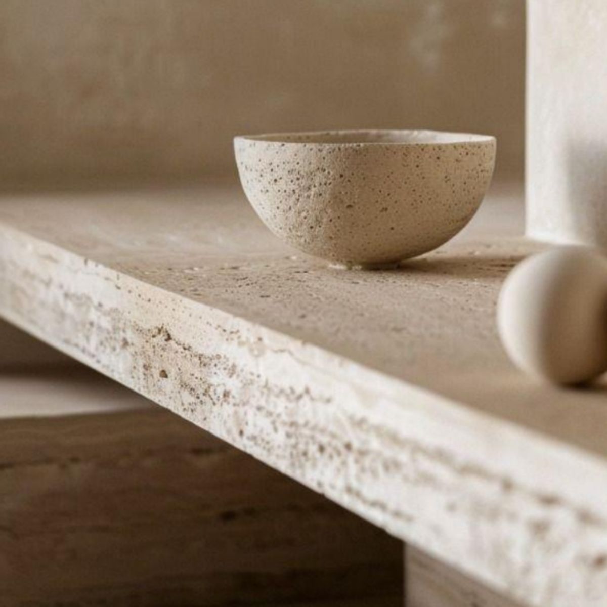
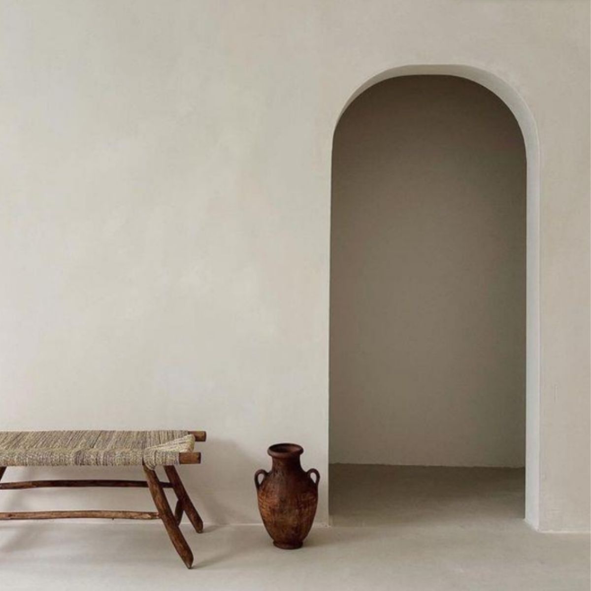
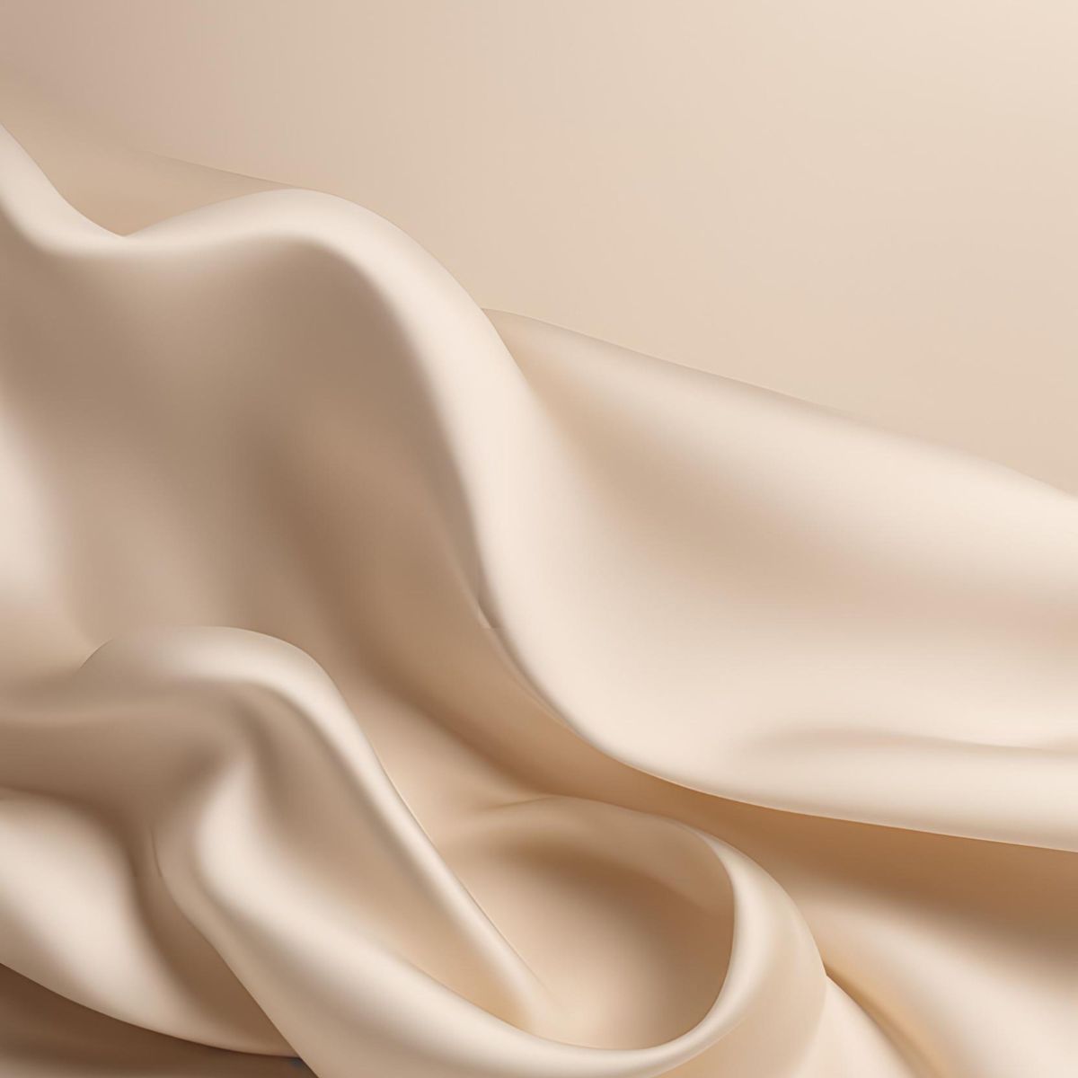
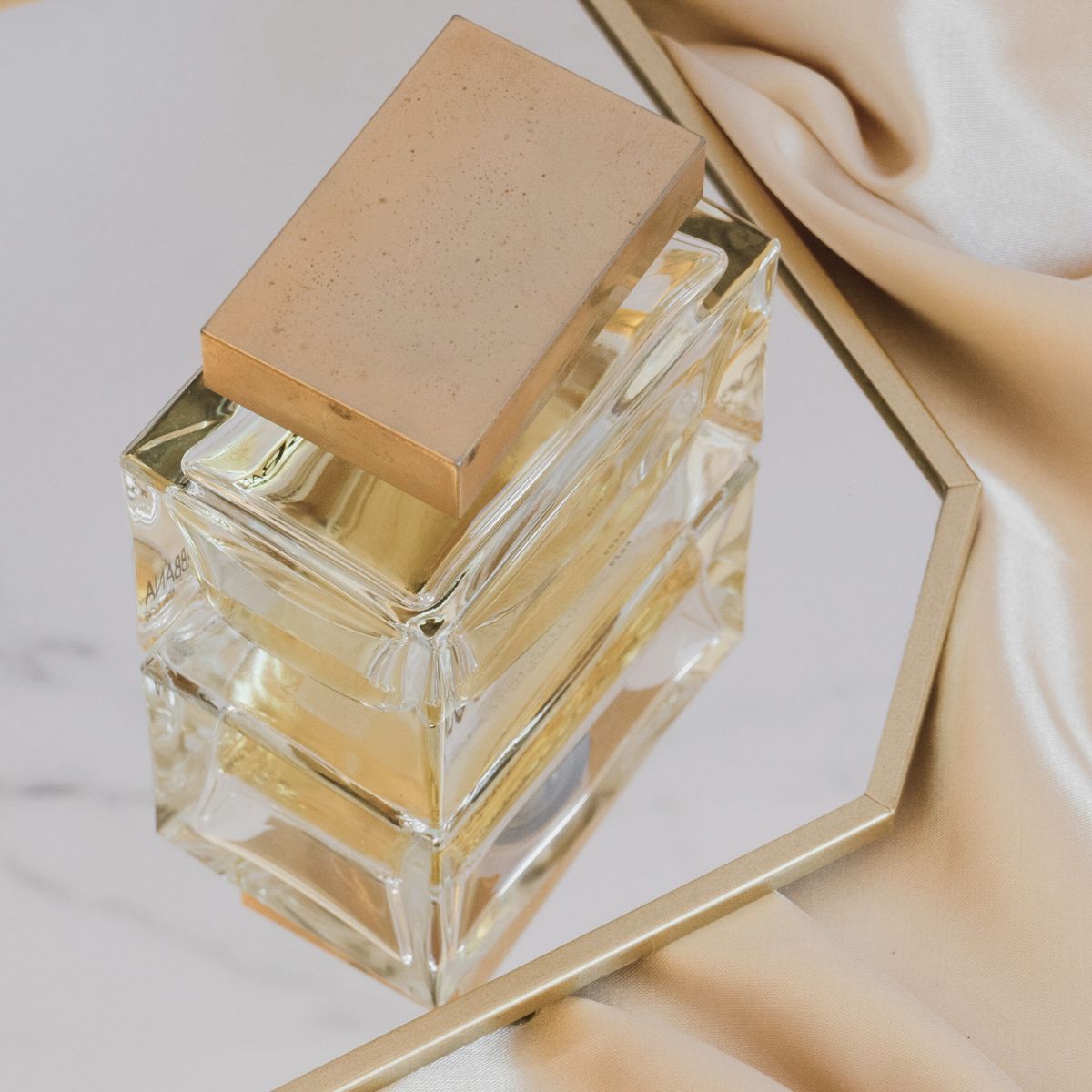
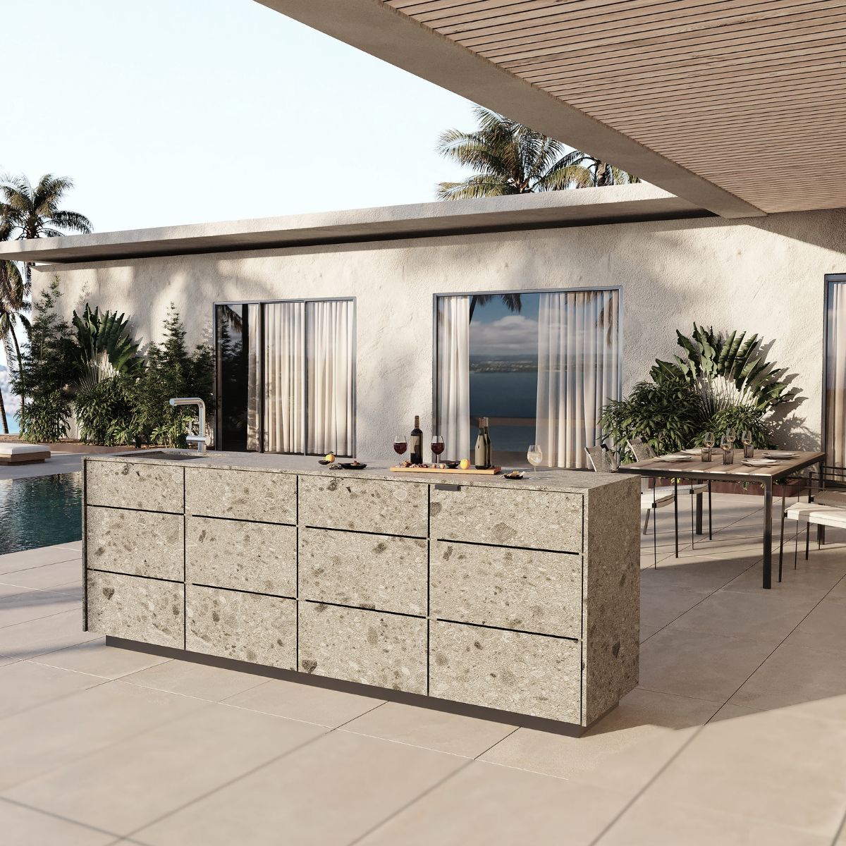
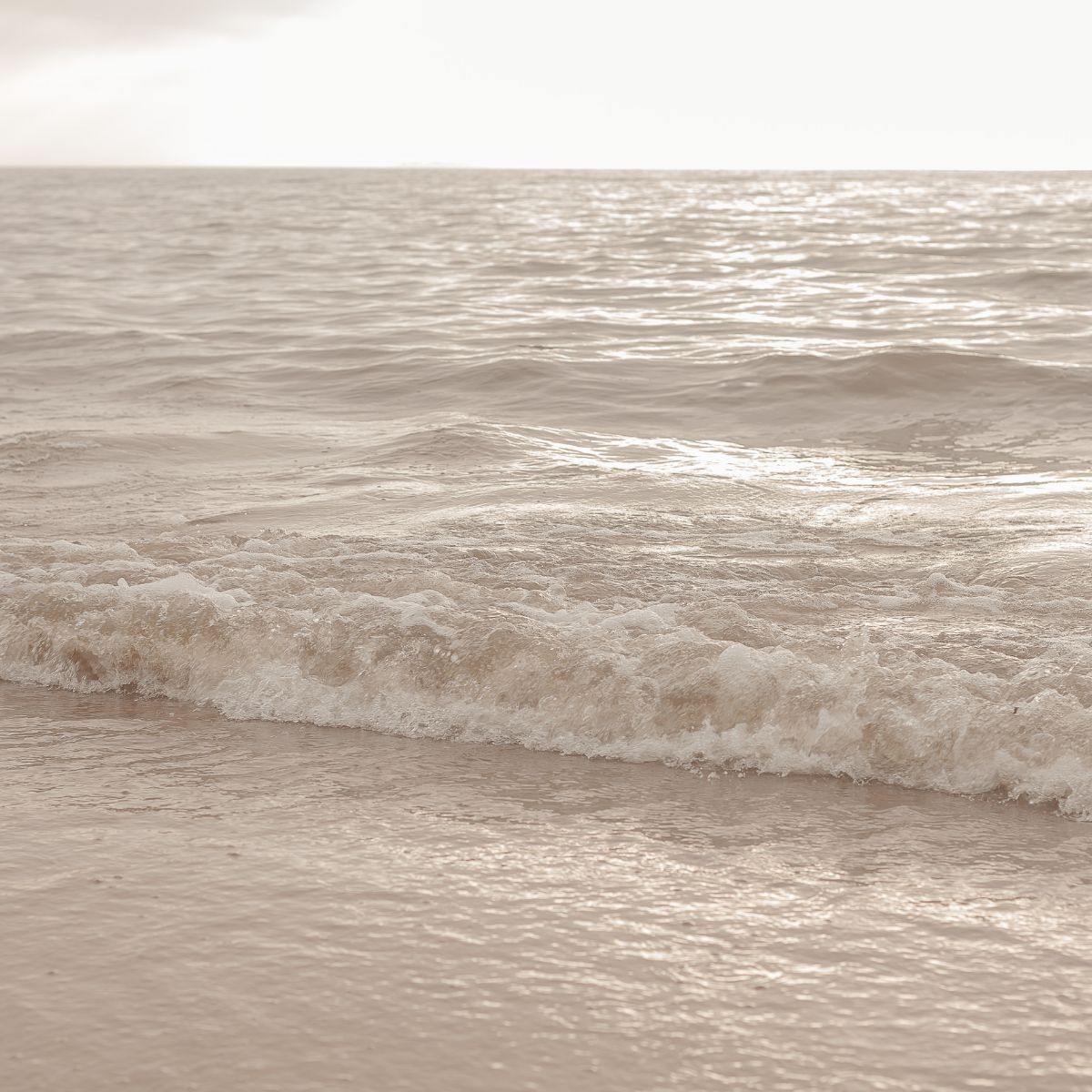
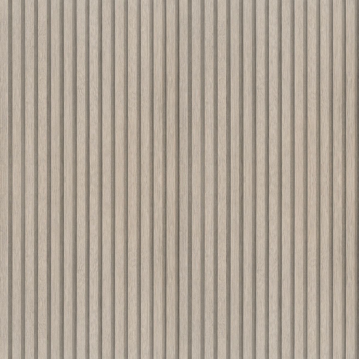
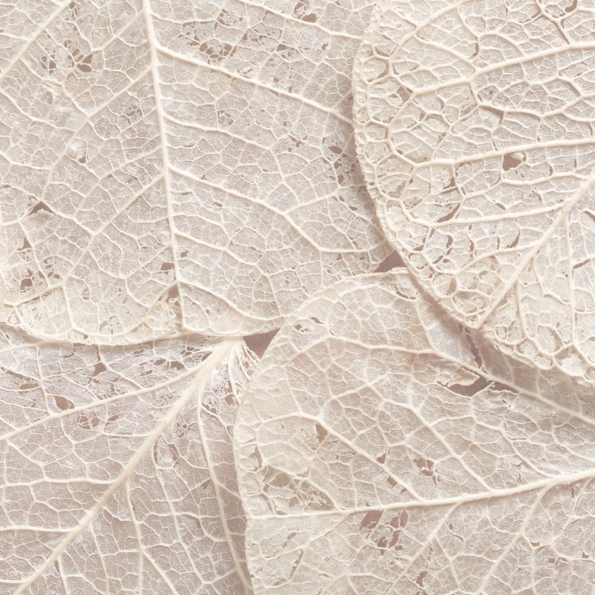
eggersmann’s new 2025–26 collection invites a return to calm, clarity, and authenticity. At the center of the expansion of finish options is the ecru color palette: a refined neutral tone languishing between beige and pale gray. The French term “ecru” means “unbleached” and reflects the color’s natural and understated character.
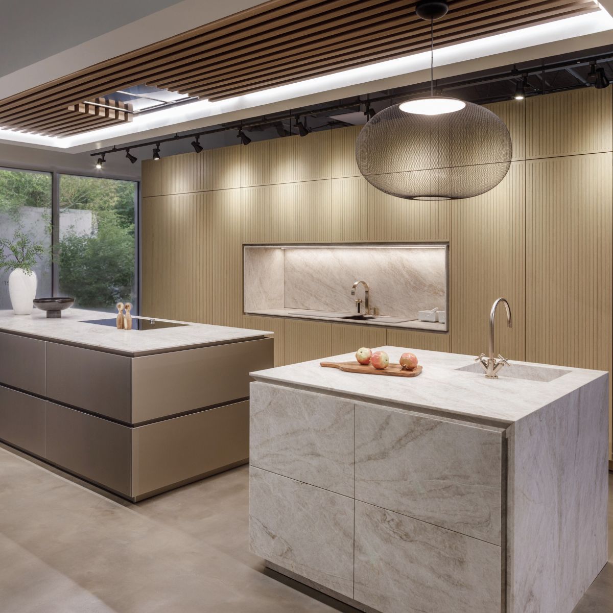
ecru is not designed to follow trends. It is intentionally soft, quiet, and pure. Its beauty lies in its restraint, making it the perfect foundation for timeless interiors that emphasize materials, form, and tactile experience. ecru pairs beautifully with natural woods, handcrafted stones, and architectural metals, bringing a cohesive and calming palette into kitchens and living spaces.
This new gentle hue expands across several of our finish ranges:
- MONZA soft matte lacquer
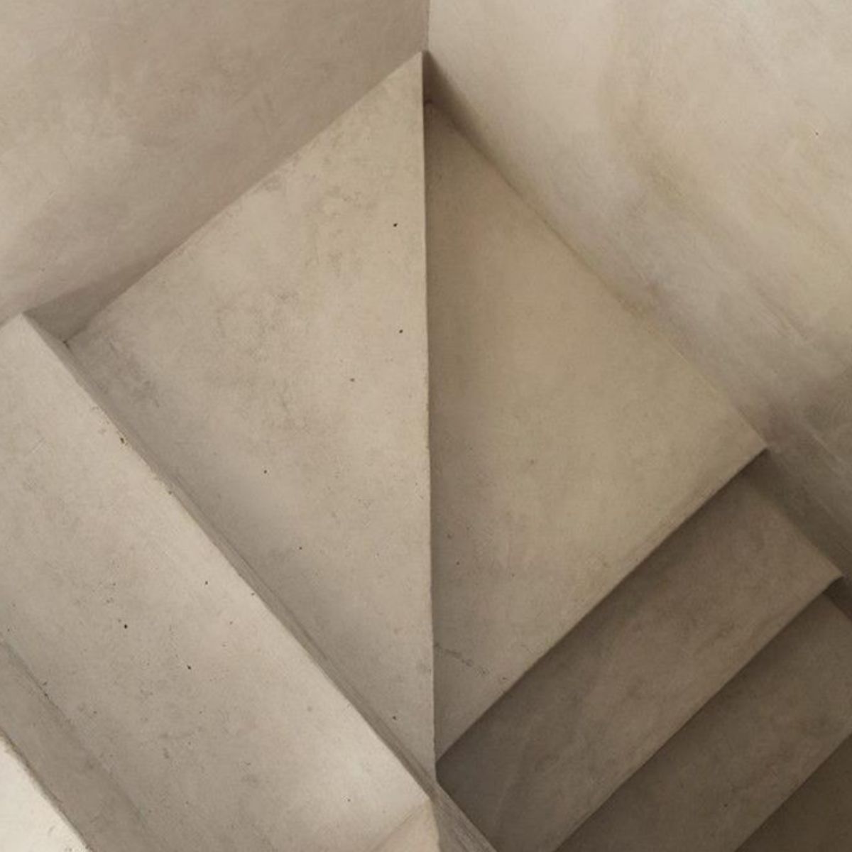
- TOKYO hand-finished concrete
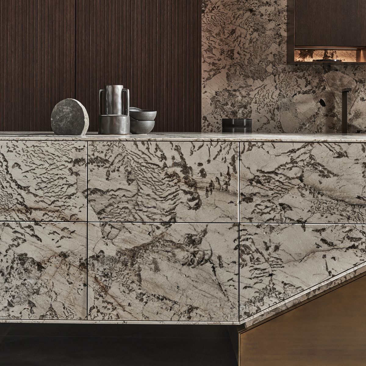
- NEVADA mineral surfaces
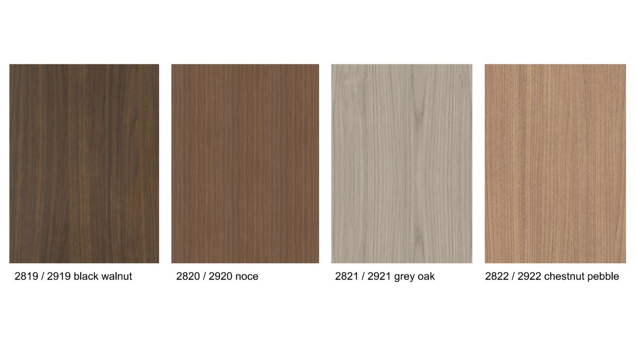
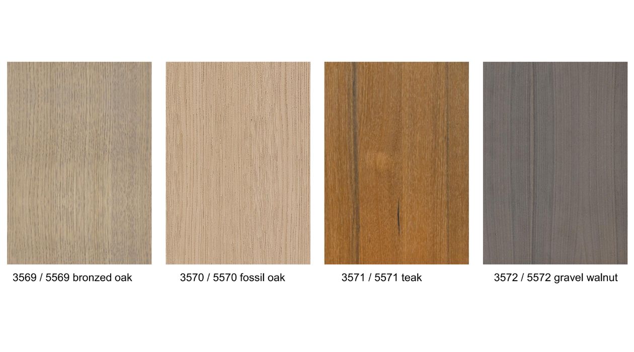
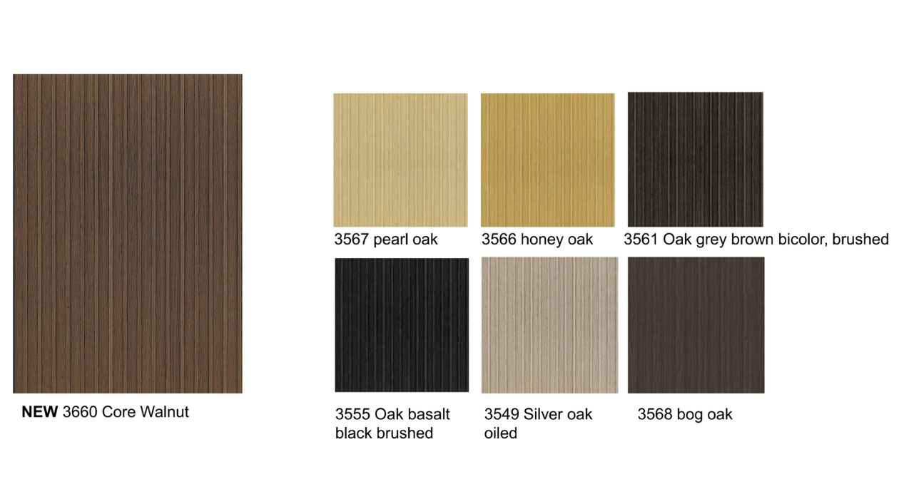
- TRONDHEIM wood décor
- VANCOUVER wood veneer
- OSAKA, reverse tambour wood veneer
- Powder-coated handles in matching ecru tones
ecru reflects current design desires for warmth, natural elegance, and sensory connection. The neutral tone creates space for visual and emotional depth through use of texture and contrast. Whether paired with glass, brushed stainless steel, or exclusive stones like White Tiger granite, ecru adds sophistication without overwhelming the space.
The color collection also introduces a palette of complementary tones, including mineral brown, alabaster, and platinum grey. These colors support a design language that feels close to nature, sensually unique, and architecturally refined.
With ecru, eggersmann continues to design with purpose. The focus remains on thoughtful craftsmanship, honest materials, and lasting aesthetic value.